Power BI Performance: Data Visualization Practices
Data visualization best practices that make Power BI reports load faster: fewer visuals per page, certified visuals and Performance Analyzer.

Founder · MCT · Editor of the official DP-600 book

En resumen
Optimizing Power BI data visualization balances visual density with DAX query execution overhead. Keeping report pages under 10 visuals, deploying Microsoft-certified visuals or Deneb, utilizing Top N filters, and configuring Edit Interactions directly reduces rendering latency and memory footprint.
- Visual Count Budget: Limit to under 10 visuals per page using multi-row cards and small multiples.
- Top N Filtering: Restrict rendered data points and group remaining categories into “Other”.
- Edit Interactions: Disable redundant cross-filtering between unrelated visuals to eliminate duplicate DAX queries.
- Performance Analyzer: Benchmark visual display times and query execution before deploying.
Data visualization is essential for creating fast, responsive, and impactful reports. If your organization needs hands-on support tuning complex models or refactoring slow dashboards, take a look at our Power BI consulting services. This article includes a comprehensive list of techniques for creating high-performing reports.
1. Keep It Simple: Minimize the Number of Visuals Per Page
Avoid overloading your reports with too many visuals, as it increases query complexity and slows performance. Try to keep the number of visuals per page under 10 to maintain optimal performance.
Use Multi-Row Cards: Replace multiple single cards with a multi-row card to consolidate information and reduce the visual count without compromising clarity.
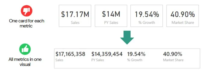
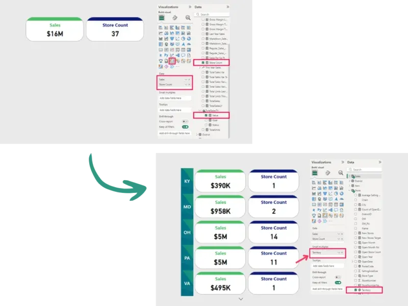
Use the New Card Visual with Small Multiples: This card visual supports small multiples, so you can compare metrics across several categories in a single visual and read many segments at a glance. You can pick a category to split the data by; in the picture below, sales are split by Territory, giving you the full picture in one card.
2. Apply Top N to Reduce the Amount of Data Displayed
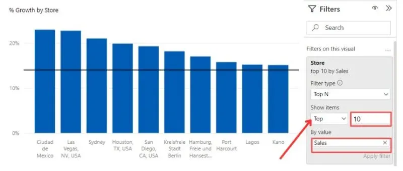
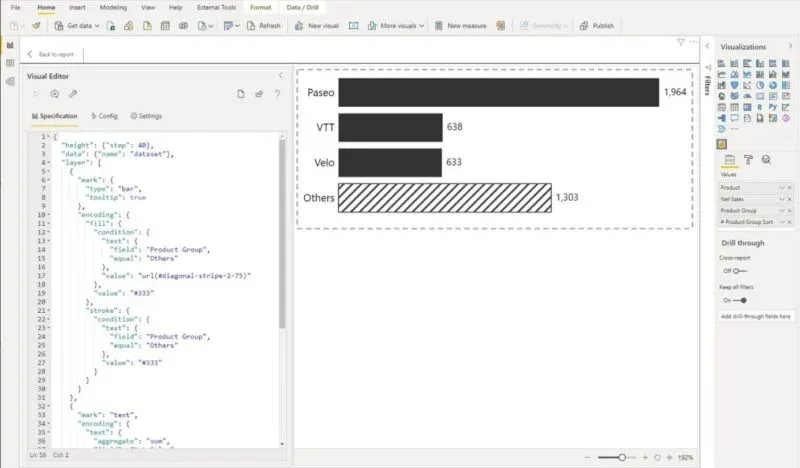
Avoid displaying all data points in a single visual. Use Top N filters to show the most relevant data, such as the top 10 customers by sales. Consider grouping the remaining data into an “Other” category, which ensures clarity and improves responsiveness while taking into account lower priority data.
3. Use Microsoft-Certified Custom Visuals
Use Microsoft-certified visuals for guaranteed performance and compatibility. These are optimized for speed and regularly updated to align with Power BI enhancements.
Advanced Option: Use Deneb for custom and performant visuals. Deneb is a certified custom visual that allows developers to create highly customizable and efficient data visualizations directly within Power BI using Vega or Vega-Lite’s JSON syntax.
4. Optimize Visual Interactions
Limit cross-filtering and unnecessary interactions between visuals to avoid redundant queries. Use Power BI’s “Edit Interactions” feature to refine or disable irrelevant interactions, especially for visuals with high-cardinality fields.

5. Optimize the Use of Slicers
Slicers are essential for enhancing report interactivity, but they can consume significant resources if overused or poorly configured. Follow these best practices to achieve a balance between interactivity and performance:
-
Limit the Number of Slicers: Avoid adding too many slicers on a single page, as they increase visual dependencies and consume significant resources, especially in large datasets. Only include slicers that are essential for user navigation or analysis.
-
Use Visual, Page, or Report-Level Filters: Move non-essential slicer functionality to the Filter Pane. These filters generally more efficient than slicers, reducing interactive overhead.
-
Use Hierarchical Slicers: Replace multiple slicers (e.g., Year, Quarter, Month) with a single hierarchical slicer. This approach simplifies navigation and optimizes performance.
-
Avoid free-text slicers: Free-text slicers are resource-intensive, particularly in large datasets. Instead, use pre-aggregated categories, numeric fields, or IDs for faster and more efficient filtering.
6. Use the Data Limit Feature
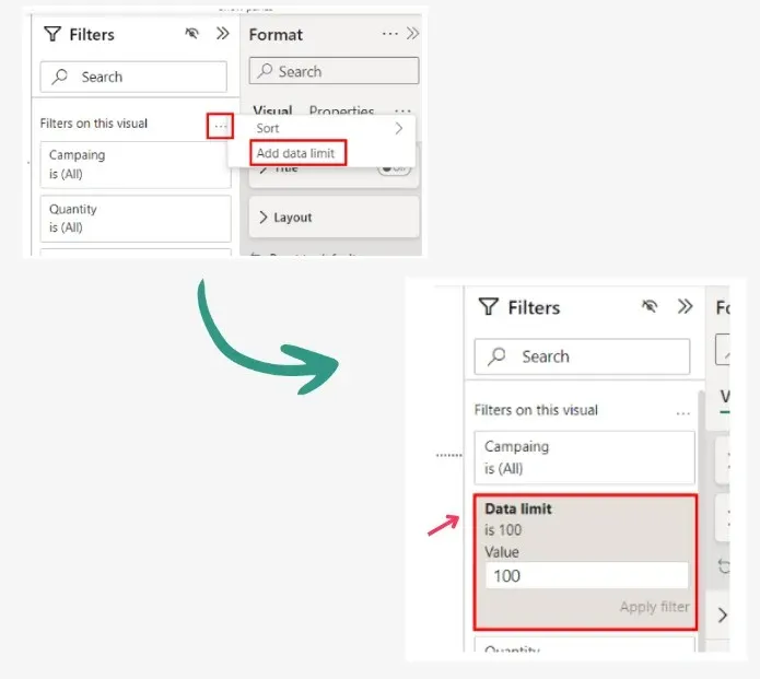
Power BI’s Data Limit feature enables you to restrict the maximum number of rows displayed in a visual, improving responsiveness for visuals linked to large datasets.
Steps:
-
Go to the “Filters on this visual” menu.
-
Set the maximum data limit to ensure only relevant rows are shown.
7. Optimize Table and Matrix Visuals
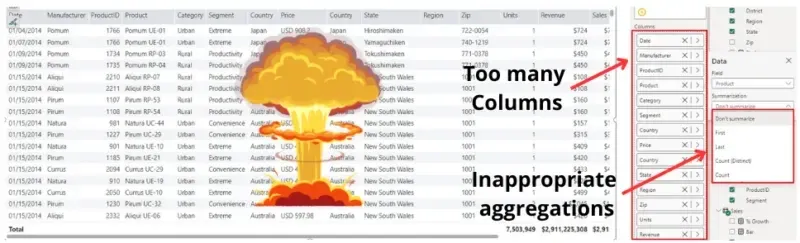
Tables and matrices are among the most performance-critical elements in Power BI. Overloading these visuals with excessive columns, multiple drill levels, or large amounts of raw data can be devastating to your report performance, turning them into resource-intensive bottlenecks. To ensure smooth performance, it’s essential to use these visuals wisely and optimize their configuration:
⚠️ Limit the Number of Fields: Avoid adding too many fields to a table or matrix, as this significantly increases rendering time and memory usage.
⚠️ Summarize and Aggregate Data: Displaying raw, unfiltered data places a heavy load on your reports. Instead, focus on summarized or aggregated data to present the most relevant insights without overloading the visual elements.
⚠️ Choose Appropriate Aggregations: Carefully evaluate which fields need to be summarized and which ones don’t. Improper summarization settings can lead to unnecessary processing and degraded performance:
-
Be Cautious with “First” and “Last”: Power BI must sort the data based on the selected field to determine these values. Sorting large datasets can be resource-intensive, especially when the fields contain many unique values or the dataset isn’t pre-filtered. This process can push performance limits to the breaking point. 💥
-
Avoid “Count Distinct” when Possible: This operation scans the entire dataset to identify unique values, making it one of the most resource-intensive calculations.
-
Limit the Use of “Don’t Summarize”: Only use this option when necessary, such as for displaying raw text or unique identifiers. Misusing it can lead to unnecessary processing and performance degradation.
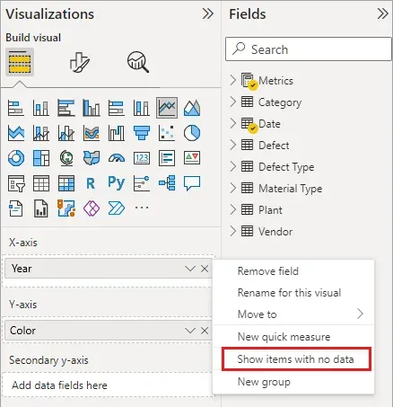
⚠️ Use “Show Items with No Data” Moderately: This option can provide valuable context by displaying all categories, but it forces Power BI to process and display rows with no values, impacting performance. Use this feature only when necessary to meet specific reporting needs and when the dataset is sufficiently filtered to prevent unnecessary processing. In large datasets, this option can can drastically increase processing time and memory consumption, potentially crippling your report’s performance. 💥
✅ Provide drill-through options: For users requiring granular insights, enable drill-through options that allow them to explore detailed data only when needed. This reduces the amount of data rendered initially, optimizing performance for most users.
✅ Use Paginated Reports for Detailed Data: For scenarios requiring large-scale data exploration, such as operational or financial reporting, consider using Power BI Paginated Reports. These reports are designed for efficient handling of extensive tables and lists, reducing the performance strain on Power BI dashboards.
8. Avoid Animated Visuals
Avoid animations like Play Axis visuals, as they can be resource-intensive. Instead, use slicers or bookmarks to allow users to navigate through different views without sacrificing performance.
9. Limit Conditional Formatting
Conditional formatting adds processing overhead, so apply it sparingly to focus on high-impact metrics, such as emphasizing KPIs that fall below targets. To enhance performance, pre-calculate conditional logic in Power Query or at the data source level, reducing the burden on in-report processing.
10. Use Bookmarks for Dynamic Navigation
Bookmarks allow you to switch between views within the same page, reducing the need to duplicate visuals elements on multiple pages. Combine bookmarks with buttons for a clean, dynamic user interface that enhances navigation while minimizing processing.
Analyze Visual Performance with Performance Analyzer
Understanding and improving visual performance is critical to creating responsive Power BI reports. Use these tools to pinpoint bottlenecks and tighten up your reports:
Performance Analyzer in Power BI
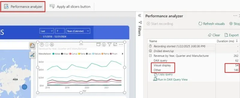
This built-in tool helps identify slow-performing visuals and provides actionable insights for optimization. In data visualization stage evaluate the following metrics:
-
Visual Display Time: Avoid using visuals with high-cardinality data that can slow down rendering.
-
Other Processing Tasks: Detect visuals causing delays due to dependencies or background processes.
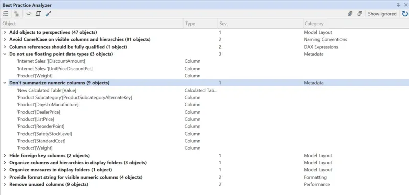
Tabular Editor’s Best Practice Analyzer
An external tool that evaluates your data model and visuals against best practices.
What has changed since this article was published?
The practices above still hold — Microsoft’s optimization guide continues to recommend the same core ideas: apply the most restrictive filters, use Top N to cap what a table renders, limit the number of visuals per page, and put every custom visual through its paces. Three things did change since January 2025, and all three affect how you apply them.
Performance Analyzer now runs in the browser
You no longer need Power BI Desktop to profile a report. Since the September 2025 release, Performance Analyzer is available when editing a report in the Power BI service: open the report, select Edit, then View → Performance Analyzer. You get the same per-visual load durations and the same Copy query button.
Why this matters for the practices above: profiling in Desktop measures your machine, not the environment your users actually hit. Data volume, concurrent users, gateways and query caching all differ in the service. Being able to run Performance Analyzer where the report actually lives closes that gap.
The service now enforces hard limits per report
Reports stored in the enhanced report format (PBIR) — the default for new reports created in the Power BI service — are subject to size limits enforced by the service:
| Limit enforced by the service | Value |
|---|---|
| Max visuals per page | 1,000 |
| Max pages per report | 1,000 |
| Max resource package files per report | 1,000 |
| Max size, all resource package files | 300 MB |
| Max size, all report files | 300 MB |
Nobody should get close to 1,000 visuals on a page — a page becomes unreadable long before it becomes illegal. The value of the number is different: it gives practice #1 a ceiling that comes from the platform rather than from taste. If a page is drifting toward triple digits, the discussion stops being about style.
Note that PBIR is still in preview at the time of writing, and administrators can opt out through a tenant setting. When it reaches general availability it becomes the only supported format.
Custom visuals have a documented resize pattern
Practice #3 says to evaluate custom visual performance. Microsoft has since published specific guidance on resize handling, and it explains a failure mode that is easy to miss when you test a visual in isolation.
When a user resizes a custom visual, Power BI calls the visual’s update() method repeatedly. If the visual treats every resize event as a full data change, it reprocesses the data view and rebuilds DOM elements on every single event.
A well-built visual does minimal viewport work during VisualUpdateType.Resize and defers layout recalculation to VisualUpdateType.ResizeEnd, using cached processed data instead of requerying.
Conclusion
By applying these best practices, you ensure that your Power BI reports are visually compelling, efficient, and user-friendly. Regularly analyze performance using tools like Performance Analyzer and external solutions like Tabular Editor to keep your reports running smoothly.
Published by